|
Today we looked at a video about skateboards and the effect of different ramps on distance traveled. This activity was used to make predictions about graphs and compare them to the actual line. There were three different ramps used, the first distance a 21 inch drop, the second a 14 inch drop, and the final one a 7 inch drop.
My predictions were that the slope for the 21 inch trial would be the most steep. I figured this because the was the most extreme of the three ramps. Things tend to go faster the more they are angled. I didn't expect the graphs to be U-shaped, but my overall predictions were fairly close to realty. I also did not account for the graphs having a roll-back period. Each graph had maximums as well, which I also predicted. Not only did they all hit a maximum, but their maximums were rather close, only differing by a few feet. Both the real and predicted graphs rose and fell at mostly the same rate and place on the coordinate plane too. Overall, my guesses were quite correct. All I really had to do to get accurate readings was watch the video and have a basic understanding of how things like physics work. Sure, my predictions were not perfect but I am pleased with how they turned out.
0 Comments
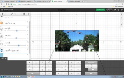 From the graph shown here, my hypothesis is that the ball will go into the hoop. The graph is -0.2x^2-0.2x+2.3
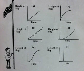 Each morning, a young boy raises a flag at his summer camp. The graphs below show different ways in which the boy could have raised the flag. Graph A shows the boy raising the flag at a steady, constant rate. Graph B shows the boy raising the flag quickly at the start but then slowing and gradually stopping. Graph C shows the boy raising the flag a bit, taking a short break, and then continuing to raise the flag in short bursts with small brakes in between. Graph D shows the boy starting to raise the flag slowly and getting exponentially faster the higher the flag is raised. Graph E shows the boy starting slowly, and then having a sudden burst of movement which begins to plateau as he reaches the top of the pole. Graph F seems to show the boy suddenly teleporting the flag to the top of the flag pole suddenly after a bit of time has past.
I believe that graph A is the most realistic of the six. This graph shows steady, consistent action. Because raising a flag is not very taxing, the boy would have no need to take breaks, such as graph C suggests. It is the most realistic to expect that he had a consistent pace when raising the flag because, while possible to raise the flag in the ways shown in graphs B, D, or E, there is no real need for such a dramatic change in pace. Graph F is obviously the most incorrect. No one could raise a flag all at once like it suggests. The boy may be able to raise a flag quickly, but the line would have more variation in it than just going straight upwards. In fact, graph F is the only graph shown that is totally impossible. |
AuthorPeri Sanderson is a Pre Calc student at MPHS Archives
November 2017
Categories |
 RSS Feed
